Martin D. Cropp - Blozonehole.com June 2016
Copyright - Please ask prior to re-publication
The Northern Hemisphere to Southern Hemisphere Annual Atmospheric Transport and Inter-related Effects
Introduction - There is a major transport of atmosphere from the high NH latitudes to the South Pole between late May and December every year. The timing, volume and rate of transfer is determined by several factors in the NH, with the transport southward through both the troposphere and stratosphere. It has remained invisible, until the OCO-2 images released in April 2016 allow us to see it for the first time. Once understood it allows a better perspective of a number of unsolved scientific mysteries, and severly questions a number of current engrained theories. Following is the first part of a series, that will visualise and discuss the annual transport and the many effects that it has. The following is a review of "The Real Carbon Cycle and missing Carbon sink" and in the process shows how little is understood about CO2, where it comes from and where it goes to. There are so many assumptions, so little fact. Beware, we are going down a path where Angels and Climate Scientists have feared to tread.
The Real Carbon Cycle and Missing Carbon Sink
Carbon Budgets - The IPCC carbon budgets and diagrams clearly identify that both natural and anthropogenic CO2 in the atmosphere is in perfect seasonal equilibrium with the land and ocean. It always balances. All CO2 that finds its way into the atmosphere either by emissions or biosphere seasonal release, is again taken up by the biospheres, apart from that fraction that remains resulting in the troposphere annual residual increase. At most there is anly ever a slight annual disequilibrium. Academics continue to measure CO2 exchange in various biological and physical systems for a better understanding. There is no evidence to support the IPCC claims, nor is there any historical evidence that the carbon cycle was ever balanced as described. It is a speculative theory and estimates. The IPCC budgets are best described as pseudoscience, convenient estimates of CO2 allocation based on a closed atmospheric system. The key word used repeatedly in the IPCC carbon cycle budget is "estimate(s)". The atmospheric science community, both AGW and skeptic seem to have swallowed the IPCC summary hook, line and sinker without question. This is representative of the extremely poor understanding of CO2 in our atmosphere. You will find a PDF of the IPCC report here.
The problem is, Earths atmosphere is not a closed system.
My analysis of the surface CO2 sample sites, the entire vertical atmospheric CO2 column, and the OCO-2 imaging clearly show a different story. Using scientifically accepted data and process, it appears that the majority of all anthropogenic, plus biosphere CO2 is being transported out of the troposphere and into the outer atmospheres never to return, by two seperate repetitious annual cycles. The losses are extensive and are recorded in the annual Keeling style Curves at the 80, 90 and 100km altitude, and higher.
Treating CO2 as a trace gas when using the OCO-2 satelite images provides crystal clear evidence of the NH to SH annual atmospheric transport, most noticably between late May to December. While the timing and total volume of atmosphere transported down the three primary ocean transport corridors to the Antarctic vortex may vary annually, it provides a clearer understanding of other unexplained events, and importantly can be quantified. As Bob Dylan wrote - "the answer my friend is blowin in the wind".
Observations
- Current interpretation of the surface CO2 sampling sites such as Mauna Loa record is not factual, and assumes that all emissions both antropogenic and biosphere (A&B) are comprehensively quantified in the seasonal tropoposphere CO2 growth phase, with oxidation and sequestration then following for a few months reducing the CO2 values. The efficiency of the oxidation and sequestration results in the annual residual atmospgheric increase.
- In reality the NH sites (MLO and higher latitude) only record the percentage of anthropogenic and biosphere emissions that remain in the troposphere, i.e. the volume that is not lost to higher altitudes during the dense NH winter months, and from late May MLO and stations located North and South then record the NH residual CO2 as it is transported toward the Antarctic vortex.
- The unseasonal equator upwelling most notable in the West Pacific region near Guam during the NH winter months is heavily influenced by the massive gaseous emissions from mid to Eastern Eurasian continent.
- The Antarctic vortex at 450 Theta altitude starts increasing in size at exactly the same time as the NH to SH transport starts in mid May 2015.
- Both the NH and SH carbon sinks are ineffective and not taking up the volume of atmospheric carbon as claimed. At best they only remove a very small fraction. This is confirmed by the OCO-2 images and the high altitude records.
- There is a substantial natural decarbonising of the troposphere, as the majority of all anthropogenic and biosphere CO2 emissions are being transported out of the troposphere, with increased CO2 values recorded at higher altitudes during 2002 to 2014.
- The atmospheric vertical column density of CO2 out to 100 km is in positive outward displacement and has been for some time, evidenced by the immediate reaction of the seasonal CO2 curves at the 80, 90 and 100 km altitudes. Decadal residual increases of 5% out to 90km are inline with Mauna Loa with >12% above 100km (ppmv).
- The annual increase in troposphere CO2 baseline residual accumulation (i.e. 400ppm in 2015) is a result of the increasing weight / density of the entire vertical column out to and beyond 100km.
- The annual incremental troposphere residual rate of CO2 increase is influenced primarily by NH troposphere temperatures particularly during the preceeding autumn, winter and spring. 2016 is a key example.
- The missing carbon sink is the ever increasing volume in the entire vertical atmospheric column and that vast area beyond the 100 km altitude.
Areas of Review
Section A - will review the thirty OCO-2 images released on 14th April 2016 that cover the period from 16th September 2014 to 8th February 2016, and the relationship with the Mauna Loa (MLO) annual CO2 cycle. Finally we have a clear understanding of what MLO records as the OCO-2 images allow us to see for the first time the massive annual transport of atmosphere from the NH into the SH using CO2 as a trace gas, and the effects on stratospheric ozone.
Section B - will review the Cold Bay Alaska (CBA) CO2 data, revealing why the CO2 curve stops rising during the winter months when biospheric and human emissions are highest. The majority of the CO2 sample sites above 50oN have the same characteristic. These sites are simply recording the level of CO2 that remains in the troposhere, not the total emitted. That flat winter curve is a "pressure curve"
Section C - will review the SABER CO2 curves at the 80, 90 and 100km altitude between 2002 and 2015, that record the CO2 loss from the troposphere into the high altitude, the timing sequence relating to sections one and two, and key points of the study.
Section A - Mauna Loa - What does the site really record ?
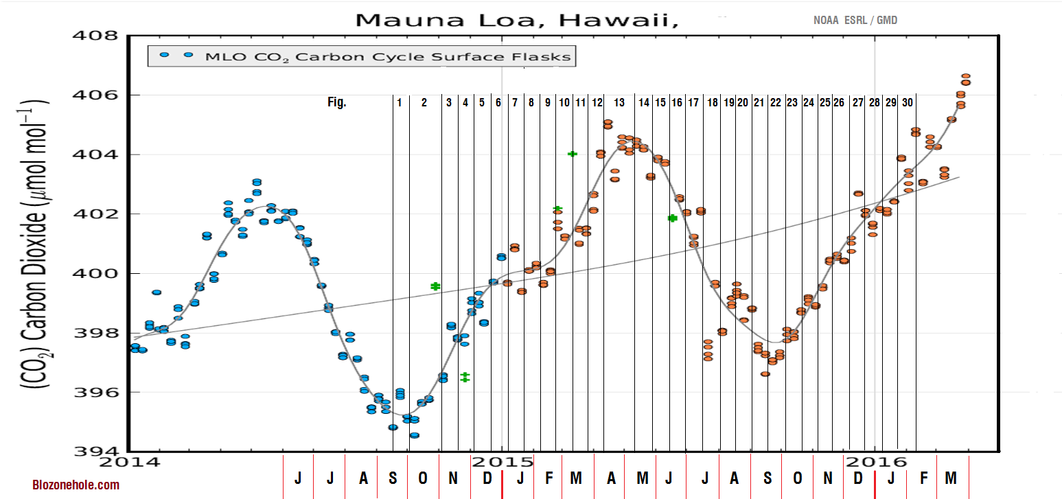
There have been theories from the first recorded data, but the annual CO2 trends do not relate to the biosphere photosynthesis cycle given the site location. To better understand MLO, I have time sequenced the thirty OCO-2 images covering the period of 16.9.14 to 8.2.16 onto the Mauna Loa (MLO) annual CO2 profile in Fig ML1. They match perfectly and provide an accurate view of the real carbon cycle. For the first time there is absolute clarity.
From October to mid May, MLO records the increasing accumulation of well mixed autumn, winter and spring CO2 in the atmosphere that circulates around the North Pacific primarily from Eastern Asia but also from Western USA, with CO2 values peaking in late May. To be clear, the CO2 recorded is only the residual that remains in the troposphere, not the total emitted from anthropogenic and biospheres. Those major NH winter losses from the troposphere are covered in Section B in a review of Cold Bay Alaska.
From late May to late September MLO records the decreasing CO2 values during the start of the annual NH to SH transport of atmosphere that travels southward from the higher NH lattitudes that is diluted with the spring/summer oxygen from biosphere activity and greater circulation / mixing as the the tropopause rises. This causes the CO2 values to decline when passing MLO and into the SH. The reduction in CO2 reading is not direct biosphere activity, simply well mixed air diluted with oxygen being transported past MLO. CO2 levels start increasing again in October as the NH tropopause continues to lower since starting in late July (autumn / winter) reducing troposphere capacity and increasing atmospheric density. While the CO2 values are rising the atmospheric transport continues through to at least November.
In short, MLO records the annual NH flushing of atmospheric "pollution" into the SH down the Pacific Ocean corridor. It is a natural cycle enhanced by the current cycle of higher NH temperatures that increase tropopause capacity with increasing anthropogenic gaseous emissions of all types contributing to the volune. The Indian and Atlantic corridors behave in a similar manner with a slightly delayed delivery down the Indian corridor, due in part by the large land mass at the north of the ocean.
The thirty OCO-2 images paint an accurate and graphic picture, as the CO2 concentrations reduce in the NH starting in May, it simultaneously increases in the SH through to November. It is simply being transported there. Only 8% of global CO2 emissions are produced in the SH, the Southern Ocean is in the cold phase so there is nothing to support the release of CO2 in the SH. The images clearly identify that the CO2 is always traveling from the NH to the SH.
You will note that the high latitude SH OCO-2 data between April to October is missing above 45oS on some images. This is unfortunate, otherwise you would be able to see the extremely high concentrations around the Antarctic vortex requiring fewer words from myself. Remember we are only reviewing the Pacific corridor transport, the Atlantic and Indian Oceans have a similar but seperate identity.
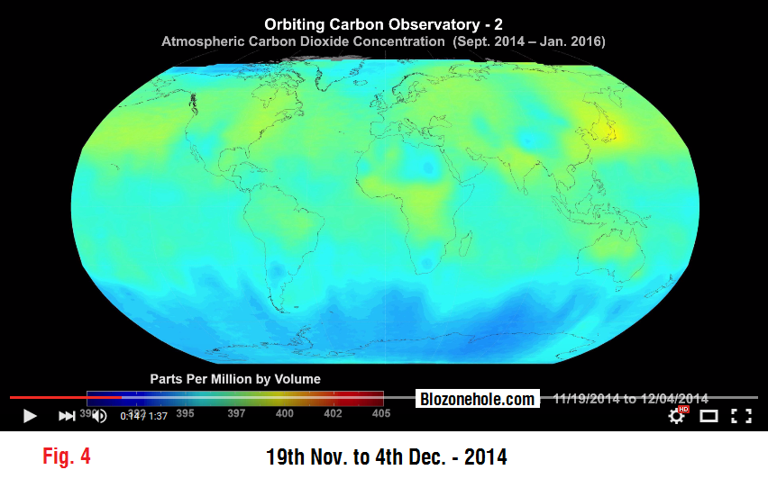
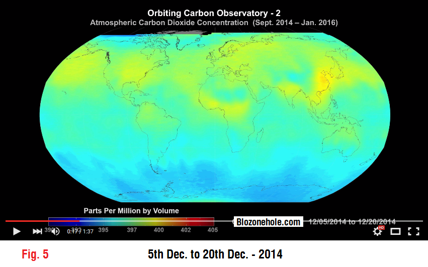
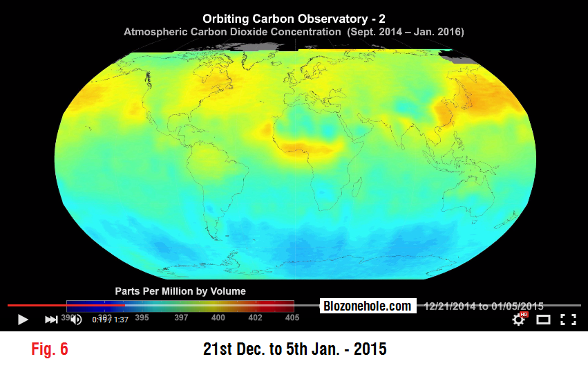
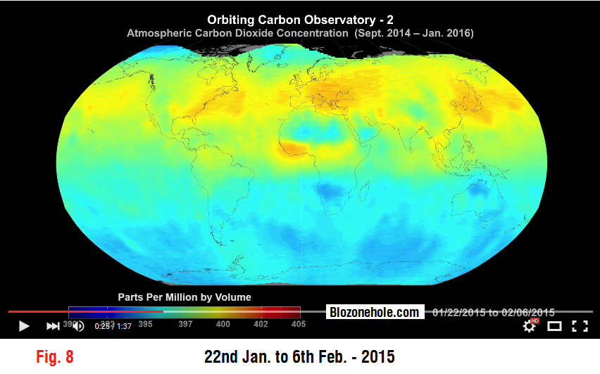
Match the images in Fig.1 to 30 to the time segments in the Mauna Loa chart Fig. ML1 directly below. Either print the MLO chart or open in a second window for ease. I have provided commentary with each image. My sincere thanks to NASA staff, in both ozonewatch and OCO-2. Your tireless work enables us to see wonderous things. All CO2 images from NASA - OCO-2.
For the CO2 charts mentioned below, go to the NOAA Data Visualisation site. Click on the site on the map, on the RH side select >Carbon Cycle >Time series >Subset of available data and select time series.
I also recommend that you watch the video made from the still images to fully appreciate the speed of the transport from the NH into the SH with the date on the screen. This is not the carbon cycle described by the IPCC.
Fig. ML1 - Mauna Loa CO2 annual trends with the OCO-2 image period detailed. (NOAA / GMD)
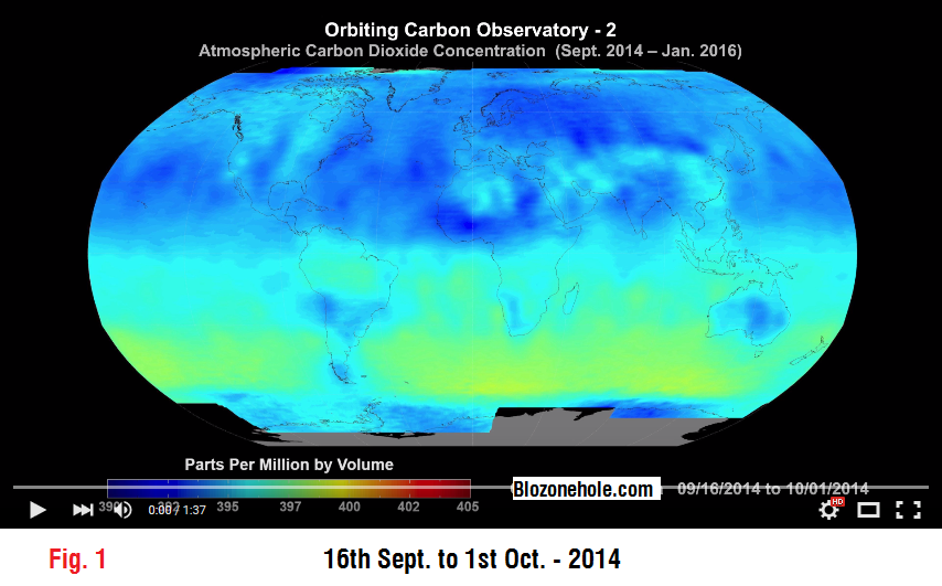
Fig.1 - The CO2 values in the NH are at the lowest levels of the annual cycle and will not be at this level again until September 2015 Fig. 20. Remnants of the mass CO2 transported into the SH that started in May 2014 are still visible. CO2 concentration values in the NH will continue to climb until early May or Fig.14.
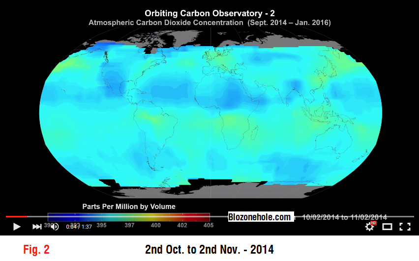
Fig. 2 - Global distribution is starting to reach equilibrioum during the month of October. The NH tropopause is reducing in height reducing capacity with emissions increasing during cooling ambient temperatures. In the SH the tropopause is rising.
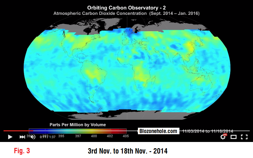
Fig. 3 - Nearest to global CO2 equilibrium. The SH tropopause is rising increasing atmospheric capacity causing CO2 dilution.
Fig. 4 - The NH tropopause is continuing to reduce in height reducing tropopheric capacity, while NH CO2 emissions are highest between the December and February. Maximum emissions during smallest troposphere capacity. High CO2 output areas are evident. The SH tropopause is rising increasing capacity.
Fig. 5 - CO2 accumulation increasing in the NH. Note in Fig. 1 through 8 the high levels of CO2 entering the Arctic region over Sweden, Finland, Norway and Northern Russia. These areas are not high CO2 emitters, the CO2 is being transported in. SH values static
Fig. 6 - NH CO2 accumulation increasing note high values in Arctic over northern Russia before data is cut off. Also high values flowing into Arctic region over Greenland from Eastern North America and Canada. The flow eastward from China out over the Pacific and onto Cold bay Alaska (CBA) and Mauna Loa. Vaues in SH static
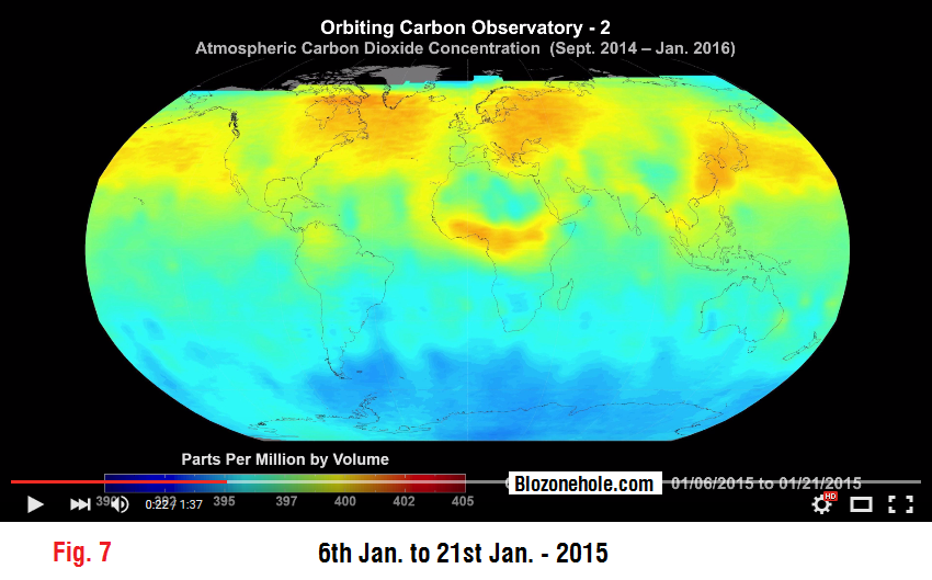
Fig. 8 - NH CO2 accumulation stagnates in line with the pause in the rise on the MLO and CBA charts. Emissions have not stopped they are at maximum. If there is limited dsorbent capacity in the troposphere, they move away. Summer in the SH and the tropopause near highest levels. CO2 values remain sparse and static.
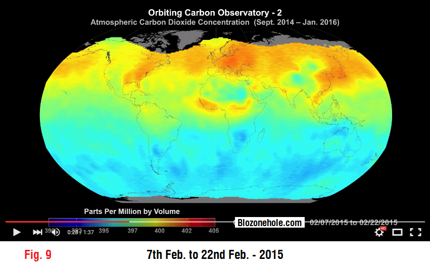
Fig. 9 - NH CO2 accumulation increasing. Key areas of data missing from high NH latitudes especially over Greenland passage into the Arctic vortex, and over Northern Russia. SH remains static
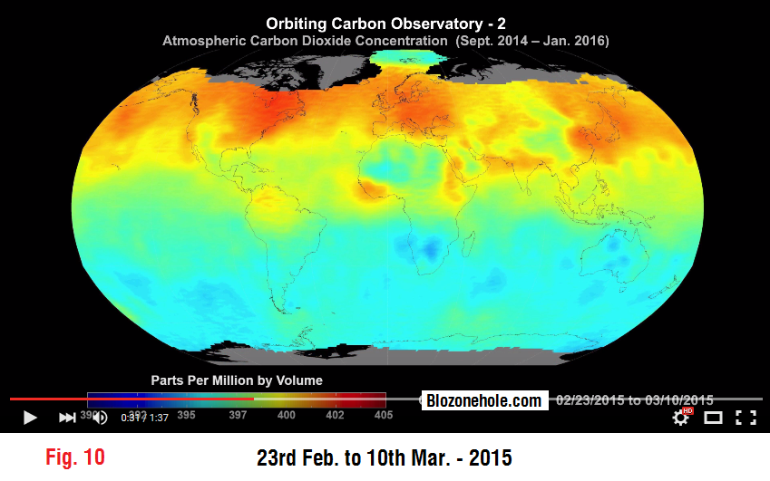
Fig. 10 - NH CO2 accumulation increasing. The largest emitters are evident, Mid / Eastern USA, Western Europe and the East of China which spreads over the entire North Pacific. The NH tropopause starts rising in early to mid March increasing capacity promoting greater circulation. Oxygenation / photosynthesis is occuring at surface level but it has no visual or recorded impact, the density keeps increasing. SH showing very minor trace of increase as tropopause starts to reduce in height and some transport southward from the NH.
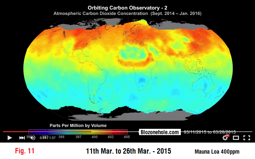
Fig. 11 - NH CO2 accumulation and circulation increasing with swelling down into the SH across the equator. SH showing increase as tropopause starts lowering. Loss of SH data starting at high latitudes. Mauna Loa records 400ppm monthly average for the first time and is just visible in mid Pacific. Visual increase in line with MLO Chart
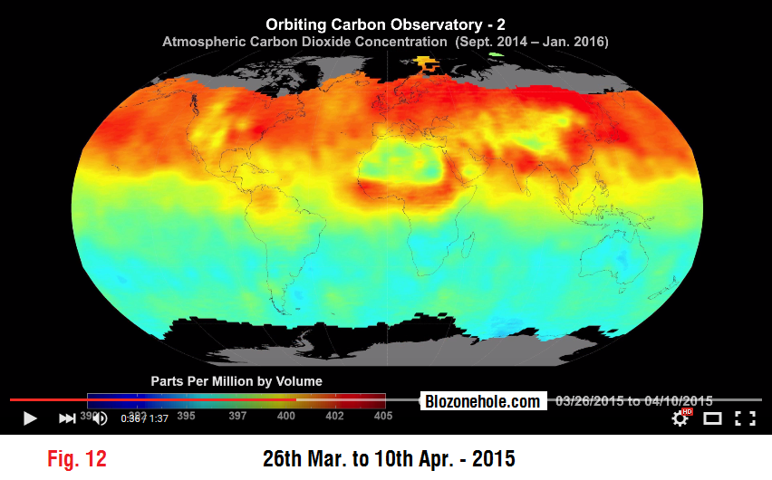
Fig. 12 - NH CO2 accumulation still increasing and flowing into SH, with CO2 becoming more noticable due to increased circulation. Reduction in SH troposphere capacity and colder dense air during Autumn. The CO2 increases are recorded at the SH surface stations. NH and SH high latitude OCO-2 data loss increasing.
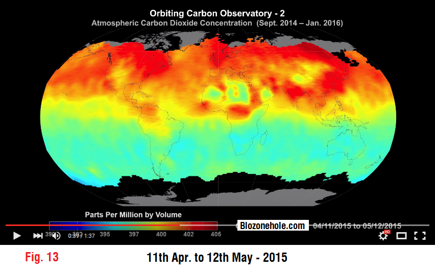
Fig. 13 - One full month and the loss of high latitude SH data disguises the start of significant southward transport that starts early May. NH CO2 accumulation increasing to near the maximum concentration in the cycle shown of MLO chart. The flow of CO2 is more noticable with concentration increasing at the 50S latitude.
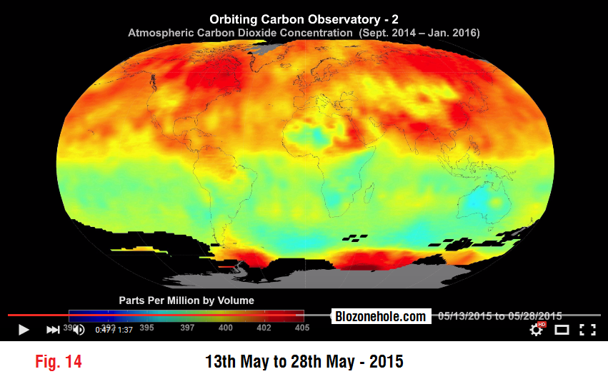
Fig. 14 - This is the start of the NH to SH transport. - Look at the CO2 flood down all the way to Antarctica with areas of 405ppm over the continent. Go back to Fig. 12 and again look at the difference in just 30 days. Remember that the SH releases less than 8% of global emissions, and there are no emissions that far south. Note the NH CO2 density moving well below the equator and southward and the rapid increase in SH mid latitudes. Note the high concentrations flowing from the tip of South America onto the Antarctic Peninsula and East Antarctic, plus the bottom of the Indian Ocean onto the Antarctica. This is transported atmosphere bearing CO2 and a really important image despite loss of data at higher than 45oS latitude.
The NH has reached peak CO2 density and from this point on will reduce until September as it is transported into into the SH. The NH tropopause is rising increasing circulation southward past MLO. The Mauna Loa CO2 curve in Fig. ML1 is starting to decline as the diluted atmosphere passes - in perfect unison with the OCO-2 image.
Lets pause and look at the Antarctic Polar Vortex which starts increasing in size at 650K Theta (30 to 20mb) altitude on April 1st, at 550K Theta (50 to 30mb) mid April, and 450K Theta (70 to 50mb) at the start of May. I have overlaid the time sequence for Fig. 13 and Fig 14 on all three.
FIG. 14 AV - The Antarctic Vortex at 650, 550 and 450 Theta
All vortex need atmosphere delivery to increase in size, hurricanes are a classic example, they draw in atmosphere and transport it mostly vertically, the Antarctic vortex is no different. This must be the incentive for the start of the mass transport of atmosphere from the NH into the SH in May, the NH tropopause is still rising and decreasing pressure and increasing circulation, while the SH is reducing in height increasing pressure restricting tropospheric transport.
If we look at the three surface sampling stations of Ushuaia Argententia, Drakes Passage, Palmer Station Antarctica, Halley Station Antarctica, and Syowa Station Antarctica there is no rapid increase or anything out of the ordinary, just the small steady CO2 increase. Nothing like we would expect, just the normal sea level transport into the low pressure surrounding the vortex.
However if we go up to the stratosphere we see this at ozonewatch, and witness the NH to SH atmosphere transport moving through the stratosphere diluting and displacing ozone on its path into the vortex. Most stratospheric ozone is located in the 450K Theta height of 70 to 50 mb. Two trace gases show the same air transport, CO2 in Fig. 14 and a stratospheric "Blozone" or removal of ozone displaced by the atmospheric transport. While at the ozonewatch website view all of the images from 13th to 28th May and see the pattern. Also view the rest of May 2015, and also 2014 and 2016 and see it is business as usual. Using the Earth NullSchool site will show atmosphere moving across the equator. We also see the start of the temperature increase fluctuations at the 10-hPa, 5-hPa, 2-hPa and 1-hPa altitude in the 65oS to 90oS region at exactly the same time. For air to fall from the mesosphere as others commentators report, it has to come from somewhere to effect the temperature over a wide area!
Let's return to the NH to SH transport and not be distracted. The following period covered in Fig. 13 to Fig. 25 covers the mass transport of CO2 bearing atmosphere into the SH. It will simply swap hemispheres, my comments will capture key points.
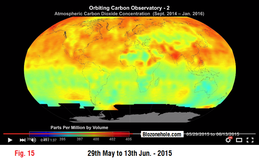
Fig. 15 - The transport southward is very evident. As CO2 values decrease in the NH they increase in the SH. Note the Indian, Pacific and Atlantic Ocean transport corridors CO2 density increase.
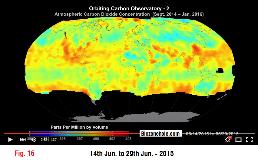
Fig. 16 - In the NH high latitudes CO2 density decreases as the low NH and all SH latitudes increase in density.
I understand that the OCO-2 satelite needs sunlight to record CO2 however New Zealand, Tasmania and the SH latitudes up to 65oS are not in a state of winter darkness, far from it. During mid winter we stiil recieve 10 hours of sunlight each day. It is hard to understand why the data is missing over the ocean to 35oS. There are high volumes of CO2 starting from 15oS all the way to Antarctica. Is this an inconvenient truth about the carbon cycle.
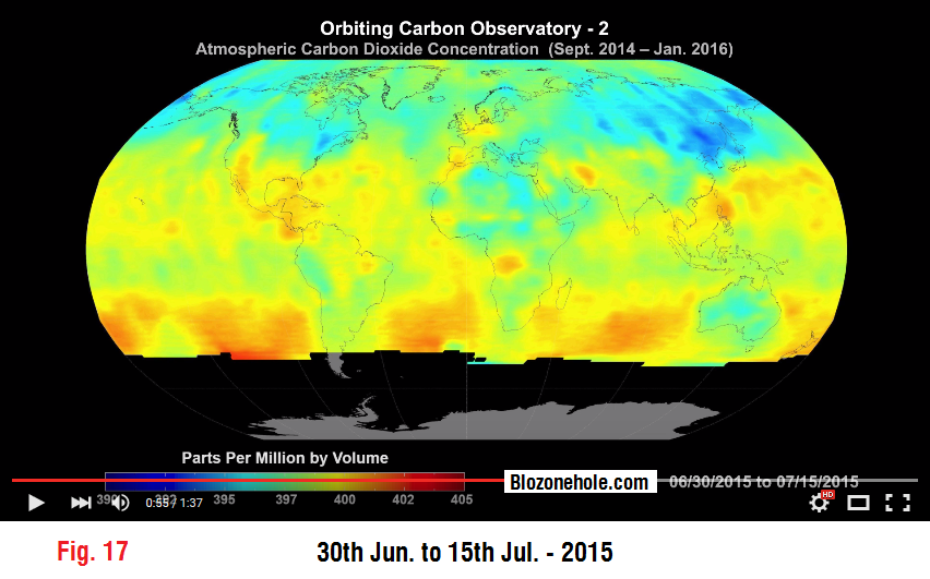
Fig. 17 - Compare this image with the previous and note the decrease of CO2 at the high NH latitudes and the density increase below the equator, in 16 days. There is no doubt oxygenation and sequestration is occuring in the NH but over 75% or more is heading south. This will be come pronouced through to Fig. 21.
The NH tropopause is starting to decline reducing tropospheric capacity adding a new pressure momentum. Note that the higher NH latitudes are depleted first as the Tropopause reduces earlier than the mid latitudes.
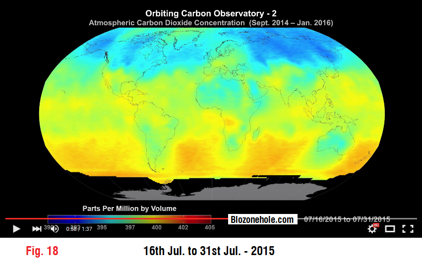
Fig. 18 - The transport corridors are now very apparent. Low CO2 values across the whole of the NH. The SH transport corridors are now almost evenly saturated. This is a natural atmospheric transport cycle that brings heat and water vapor to Antarctica increasing both mainland ice thickness, increasing sea ice area, and temperature. The Antarctic vortex continues to increase size.
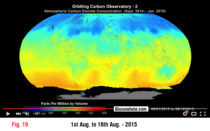
Fig. 19 - Visually CO2 appears to be at the lowest point in the higher latitudes, but the MLO data it is still declining. Watch it decline in density over ML until Fig. 22 matching the sampling data.
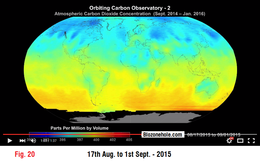
Fig. 20 - The declining NH tropopause from late July accelerates air transport south by pressure There is a restriction above Antarctica with the frozen column of atmosphere acting as a barrier to vertical transport, but this changes when sunlight hits the column in Mid September.
The SH tropopause is about to start rising with spring expanding atmospheric volume. There is now very high levels of CO2 saturation in the SH vertical column, and nearing the NH low, and about to start increasing in the NH high latitudes as the tropopause and atmospheric capacity both reduce and emissions increase.
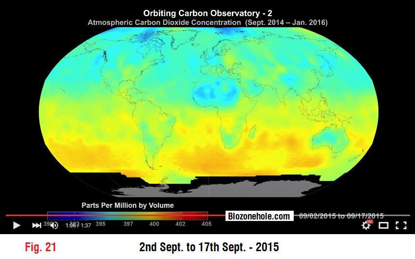
Fig. 21 - The CO2 density remains in the SH up to the equator despite a rising tropopause increasing capacity. The transport from north to south is still occuring and will continue until December. The first of the Spring sunlight is reaching the cold column of air in the stratosphere over the Antarctic increasing temperature and easing the vertical passage from the troposphere.
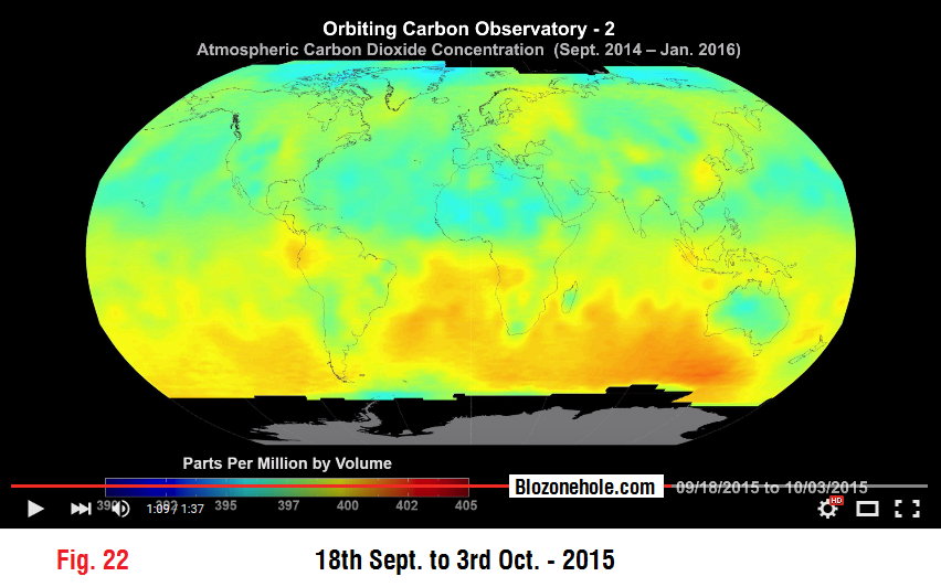
Fig. 22 - Is the same time in the annual cycle as Fig. 1. It must be remembered that CO2 emissions have not stopped in the NH and have continued to flow southward motivated by the reducing tropopause, with the density now starting to increase in the reduced atmospheric capacity.
While CO2 values start increasing at the high NH latitudes, this is the lowest point in CO2 values in the ML cycle. You can see the Islands clearly in the mid Pacific. From now on the values increase as seen in Fig.23 and site records the next cycle of accumulation. The MLO chart matches the OCO-2 images perfectly.
In the SH you will notice an increase of CO2 transport down the Indian coridor, under Australia and across New Zealand, where it heads south to the vortex. The Indian corridor is usually the last to deplete and is responsible for the strong westerly winds that savage Tasmania and New Zealand during the October and November periods. Week long persitant winds with gusts exceeding 160kph (100 mph). The SH tropopause continues to rise increasing atmospheric capacity showing a slight dilution.
Late September is the peak Antarctic sea ice extent covered in a seperate section. It is interesting how the extent varies and the many influenecing factors.
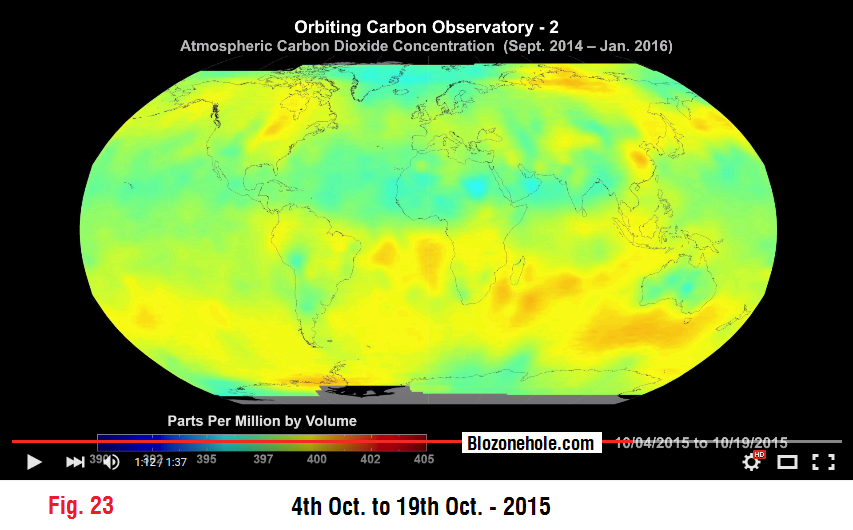
Fig. 23 - The increase in accumulations in the high NH are purely from emissions as the reducing tropopause height and increased pressure in the NH stops the flow of atmosphere from the SH back into the NH. Gaseous outputs in the NH are starting to increase towards the winter peak during thecolder months. In the SH from this point to March the CO2 concentration "appears" to reduce. Increasing atmospheric capacity as the tropopause increases in height causing appearance of the dilution. The air mass is still coming from the NH.
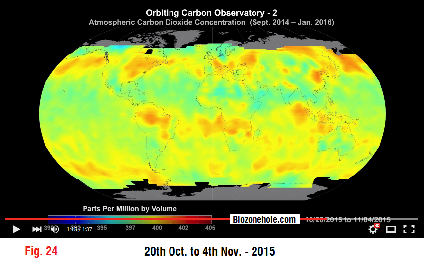
Fig. 24 - Increasing concentrations in the NH, Eastern North America, Western Europe, China spreading across Nth Pacific, Brazil and Asia minor are the primary sources. High residual in the SH over the Southern Ocean and mid latitudes. Note the trail of CO2 density heading toward the South American tip
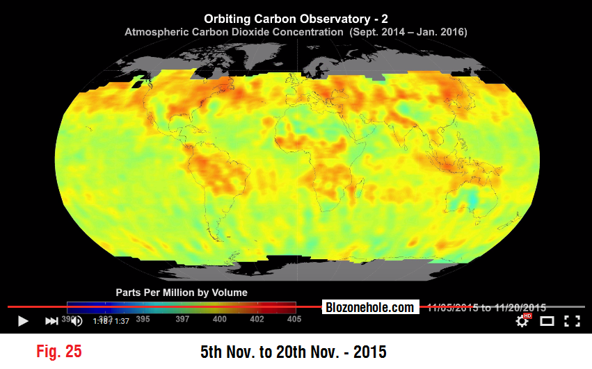
Fig. 25 - NH tropopause is still decreasing and SH is rising, the transport is still in process. Loss of data from 50oN.
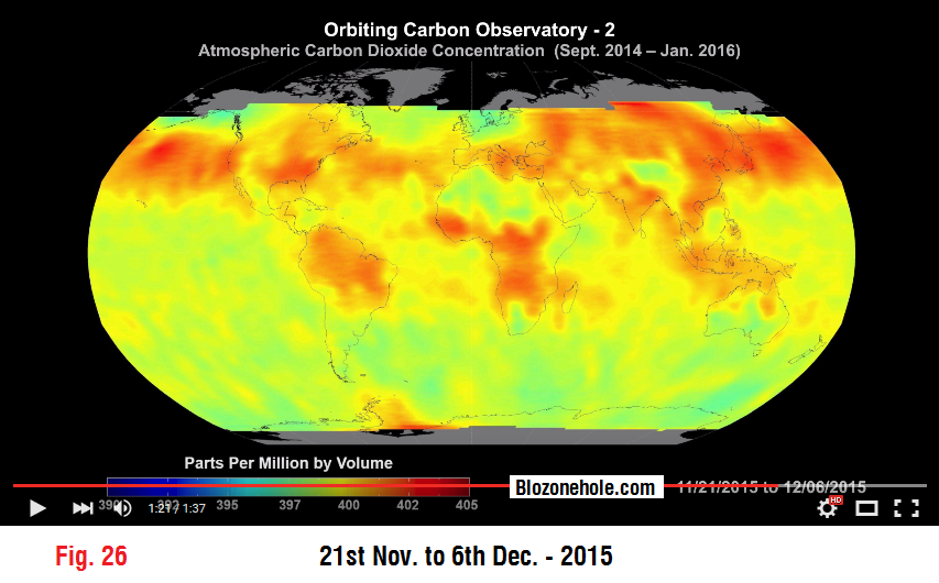
Fig. 26 - The emissions from the Eurasian continent spread across to the USA with China the major contributor. Brazil, mid Africa and Asia minor also strong contributors. Note the high concentrations over Antarctica at the South American tip and look here for the cause. Atmospheric transport is now coming from the troposphere and the ozone hole looks different than those identified earlier in the season. I have chosen this one as a classic example of angular entry from the troposphere and also breaching through the stratosphere to the vortex.
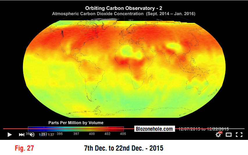
Fig. 27 - NH tropopause nearing the lowest annual level with surface pressures increasing across the mid Euraisian continent. The pressure band is causing atmosphere bearing CO2 to disperse into 1) North into the Arctic Circle with traces visible over Greenland and Northern Russia (more evident in Fig. 28), 2) southward into the SH where it is recorded at the surface stations down to the Antarctic, and 3) up to to higher altitudes at the recently identified unseasonal equator upwelling. Full latitude data coverage has now been restored, which is remarkable.
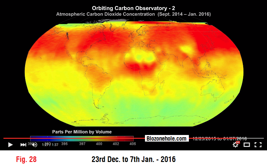
Fig. 28 - Note the transport of CO2 into the Arctic circle over Northern Russia. The highest monthly temperatures increases for January and February were in this area. There is an increase in concentration flowing from the NH into the SH especially down the Pacific corridor, with no noticable pause over the Dec, Jan and Feb period compared to 2014.
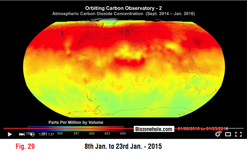
Fig. 29 - Again the NH transport into the SH is most noticable down the Pacific corridor. The Asian cold waves stimulated circulation, with ML showing a slight increase in the annual trend. Note the rise in density building at the bottom of South America. This is a flowing stream of atmosphere heading to the vortex. If you visit the NASA ozonewatch website and view the images in January between the 8th and 23rd you will observe most images showing an atmospheric transport track that is diluting the ozone (blowing it away - Blozone area). During January the transport into the SH is still very active, it is a year round event with a peak during June and November, documented in the South Pole surface station CO2 data.
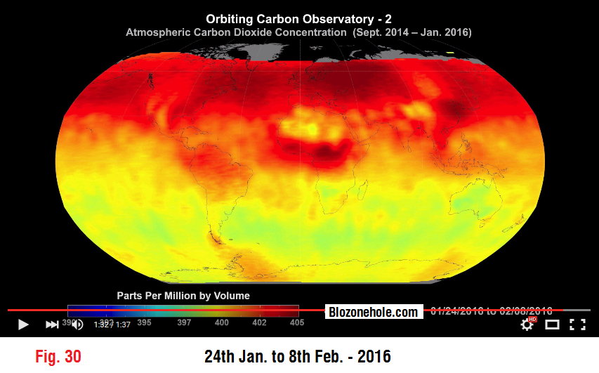
Fig. 30 - The concentrations over Eastern USA, North Eastern USA Northern Eurasia and Russia are intense with considerable flow into the Arctic region and southward as described in Fig. 27, and evident through to Fig. 30.
Fig. 30 is very important as we move forward as it provides answers to a number of unsolved issues. Of note are the two two large concentrations over Antarctica. The most prominant one tapers off from South America over the Antarcrtic Peninsula and the Weddell Sea and onto the continent. The second is below Australia with flow entering Antarctic over Victoria Land at 150o East.
During January and February atmospheric pressures are already high in the NH. Late in January a severe cold wave / cold snap hit parts of Western Europe, but most noticably over the whole of Eastern Asia including Japan causing disruption and loss of life. This rapidly reduced atmospheric capacity in the region as the tropopause reduced even further and displaced a large wave of atmosphere down the Pacific corridor. Both of these high concentrations of CO2 over Antarctica record the atmospheric transport to the low pressure Antarctic area, made visible by the CO2 trace for the first time.
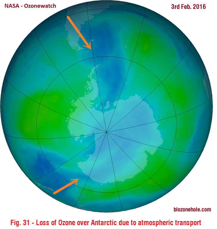
The atmospheric transport can also be seen clearly in Fig. 31 below, as the same atmospheric flow primarily through the stratosphere displaces ozone. Two trace gas trails recording the same event.
I have a saying - when the NH catches a cold (cold snap / cold wave) the SH gets the sneeze. Most rapid cooling events are tracable by looking at the ozonewatch images.
Fig. 31 - Atmospheric transport is the cause for the ozone dilution in this image, and relates to the CO2 trace in Fig. 30. Atmosphere is being transported through the stratosphere onto the votex. Waugh et. al 2009 in the review of other papers of the Antarctic vortex identifies that these "tails" are leaving the vortex.
“These simulations showed Rossby wave breaking at the edge of the vortex, resulting in filaments of vortex air being stripped from the vortex and stirred into middle latitudes”
Here we have clear evidence that they are not tails leaving the vortex but atmospheric entry trails.
Here is another image with the same stratospheric trace is visible during ozone hole season. It is evident where the transport is coming from. This will be covered in part three.
Now review Fig. 24 and Fig.26 where the same CO2 trace is visable from the southern tip of South America, then view the daily composit images of ozone loss on ozonewatch over the same time period and the same ozone loss due to atmospheric transport is visible. Too bad the data was not available from OCO-2 from Fig. 12 through Fig. 25 for the high SH latitudes. One thing is for sure, you will never look at the loss of ozone near either pole the same again.
Section Two - The Northern Hemisphere Winter CO2 loss
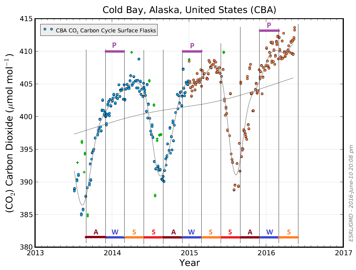
The OCO-2 images allow us to visualise two NH winter CO2 accumulations. The concentrations in the images continue to increase progressively in density from December through to May, so why does the data at Cold Bay Alaska (CBA) which is located in the direct path of the highest volume of CO2 emissions from the Asian continent usually show only a slight increase from December to February, and then a slight kick up in Spring. The majority of high latitude surface stations above 45oN record a similar same trend. Why, when CO2 emissions are at the highest annual level .
Fig 32. Cold Bay Alaska (CBA) CO2 Cycles - 2013 - 2016
Cold Bay – Is located in the far North Pacific in a low pressure zone and is particularly relevent as it records the eastward atmospheric flow from the Eurasian continent where about 65% of all anthropogenic CO2 emissions originate. Fig. 32 shows a rapid rise of 14 ppm in autumn 2014 followed by a stalling phase in winter of 2014 / 2015 with only 3ppm accumulation. Why does the accumulated volume of CO2 stall rather than rocket upwards in volume during the winter months?
The answer appears quite simple. The tropopause is at the lowest annual level which reduces tropospheric volume, the air is cold and dense and therefore fully saturated. There is insufficent atmospheric capacity to adsorb not only the CO2 but all other gaseous emissions. Regardless of the volume of CO2 put into the atmosphere it will not register and increase. As it can't be either adsorbed or accomodated in the atmospheric space, it travels, so the CO2 values that CBA and other mid to high latitude sites record is the content in the atmosphere flowing into the Arctic vortex where it is transported to higher altitudes. It has no chance and does not accumulate to reach a winter peak.
The P on the chart during the Winter months stands for what I call a "Pressure Curve" As the NH tropopause descended in Autumn decreasing troposphere capacity, emissions are increasing and the atmosphere is cooling, this is evidenced by the unusual rapid autumn CO2 increase. My previous experience has repeatedly confirmed that all fluids (air) and liquids have a saturation point controlled by temperature. A look at the CO2 values from the sampling sites in East China and the Asian region, the highest emission area tell a tale of continuous CO2 evacuation, not accumulation.
The bulk of the atmosphere bearing CO2 during winter is being forced away from the high pressure area of the NH emissions belt of up to 1060 mbar to the path of least resistance, to low pressure areas as low as 960 mbar. The atmosphere flows in two main directions:
1) South towards the recently recognised unseasonal equator vertical upwelling where it is transported from the troposphere into higher altitudes. This has been evident and documented by the upwelling of energy into and through the stratosphere, towards the mesosphere, around the entire equator region, but most obvious in the Western Pacific region near Guam. Chen and Sun published a paper in 2011 that described the greatest upwelling occurring in January, the heart of winter, which was the opposite of what was expected. This is the period of the highest volume gaseous emissions, lowest tropopause height and highest atmospheric pressure. The winter upwelling phenomena have been identified to have the primary affecter being planetary waves with regard to amplitudes of surface forcing and secondly the seasonal tropospheric cycle. While sea temperatures may facilitate opportunity due to the greatest land-sea contrasts in temperature, the sheer volume of gaseous emissions from the Asian region so close at hand is also a major influencer.
2) The atmosphere above the emmissions belt (>50°N latitudes) flows toward the low pressure of the Arctic circle upwelling to higher altitudes. Heat is also transported into the Arctic region.
What Cold Bay Alaska and other sites above 50oN such as Mace Head, Ireland are recording is the residual CO2 that remains in the troposphere at surface level during winter. Not all anthropogenic and biospheric emissions are recorded as they do not remain in the troposphere. This is the NH winter natural decarbonisation of the troposphere. The OCO-2 images in Part One visualised the accumulation in the NH, and the NH to SH transport that continued the troposphere decarbonisation of the NH CO2 winter residual. i.e. what was left.
In both the Spring of 2014 and 2015 the effects of the rising tropopause can be seen in mid March on the CBA CO2 chart, as tropospheric capacity increases increasing circulation allowing more emissions to stay in the increasing volume of the troposphere.
The winter of 2015 / 2016 had the highest temperature anomalies recorded due to El Nino. The increase in atmosphereric temperature provided greater tropospheric volumetric and adsorbent capacity and circulation in the NH, with the increase in CO2 accumulations blatantly evident. NH seasonal temperatures are the primary influence that sets the scene for annual CO2 incremental increases particularly the autumn, winter and spring preceeding. The only thing that has changed to increase the incremental CO2 level is temperature.
Section Three - Recording the CO2 Loss From the Troposphere
It is evident from the images and description in the previous two sections that the carbon cycle as depicted by the IPCC is not correct. The following chart is a time series of SABER CO2 VMR averaged over 60 days (the SABER yaw cycle) and over the latitude range +- 54o with altitudes of 80km (pink), 90km (red), and 100km (blue). The time series of CO2 measured at MLO is denoted in black. The supporting paper is found here.
The following is the Abstract from the paper, note last sentence bold mine
"Carbon dioxide measurements made by the Sounding of the Atmosphere using Broadband Emission Radiometry (SABER) instrument between 2002 and 2014 were analyzed to reveal the rate of increase of CO2 in the mesosphere and lower thermosphere. The CO2 data show a trend of ~5% per decade at ~80 km and below, in good agreement with the tropospheric trend observed at Mauna Loa. Above 80 km, the SABER CO2 trend is larger than in the lower atmosphere, reaching ~12% per decade at 110 km. The large relative trend in the upper atmosphere is consistent with results from the Atmospheric Chemistry Experiment Fourier Transform Spectrometer (ACE-FTS). On the other hand, the CO2 trend deduced from the Whole Atmosphere Community Climate Model remains close to 5% everywhere. The spatial coverage of the SABER instrument allows us to analyze the CO2 trend as a function of latitude for the first time. The trend is larger in the Northern Hemisphere than in the Southern Hemisphere mesopause above 80 km. The agreement between SABER and ACE-FTS suggests that the rate of increase of CO2 in the upper atmosphere over the past 13 years is considerably larger than can be explained by chemistry-climate models."
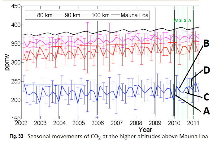
Figure. 33 Seasonal movements of CO2 at the higher altitudes above Mauna Loa
The authors expressed great uncertainty as to the reasons for volume and magnitute at these levels given current knowledge. Given the evidence above my interpretation is :
A - NH winter - the movement of CO2 from the major NH emissions belt follows a path of least resistance, and as a result it travels towards the south and north until reaching the equator and Arctic upwelling. Where it then rises vertically into the higher atmospheres showing a significant rise in CO2 at all three altitudes.
B - NH spring - the rise of the Northern Hemisphere tropopause in spring increases the atmospheric volume and reduces the pressure, which restricts the flow to higher altitudes.
C - May to November - this is the outward flow from the NH to SH transport. The decrease in the NH tropopause height in late July increases troposphere pressure and momentum to displacing the CO2 rich atmosphere southward. The majority of the movement is towards Antarctica where it is transferred to higher altitudes, with some atmosphere continuing out the equator upwelling.
D - NH autumn - the tropopause is nearing the end of height reductionand air displacment air southward. The SH spring increases the height of the tropopause alleviating the incoming atmospheric pressure from the NH and reducing the loss.
Notes
Where the CO2 curve peaks at MLO in Fig. 33 and starts to decline, it is in close proximity to the rise in CO2 at higher altitudes. MLO records the transport south mainly to Antarctica, and the rise at all three altitudes above.
From this CO2 chart in Fig. 33 even though there are only six readings (sweeps) per annum we can see that the 80, 90 and 100km are in sync with the cycles described above in Sections one and two above. The entire vertical column is in outward displacement. It is not random or chaotic, it is simply responding to what is happening at surface level. The high altitude curves vary in volume movement year to year to reflect the tropospheric / surface temperature driven conditions.
At the 80 and 90km altitudes CO2 accumulations are increasing in sync with MLO. The increase in volume at 80 and 90km increases the column weight / density and therefore the tropospheric residual increase.At 100km while the annual movements are great the residual appears near static as the CO2 passes through to the ultimate carbon sink - space.
The Study by Jai Yue et al, concluded that at the the 80 and 90km levels the decadal rate of increase was inline with Mauna Loa at 5%, but at 110km altitude the rate increased to 12%. After extensive reasurch my summary is that all sampling stations on the surface and those readings out to 80 and 90km altitude are simply "bus stops" measuring passing traffic. They do not depict the true extent of anthropogenic and biosphere emissions, they record the seasonal amount that passes through. There is NO full seasonal accumulation within the troposphere that accounts for all emissions. This is evident when looking at Fig. 30 and 31, where the CO2 is seen entering the Antarctic vortex at stratosphere altitudes without any record at surface level. It is not until the 110km level where the movement slows and true accumulation starts.
What must be remembered is that the CO2 transported to higher altitudes and beyond is part of the normal troposphere atmospheric mix. Lighter gases such as Oxygen, Hydrogen and Helium are leaving our atmosphere at much higher altitudes according to this report "The curious case of Earths leaking atmosphere" mainly via the poles at a rate of 90 tonnes per day. CO2 is heavier and appears to be accumulating at atltitudes detailed directly above. I have not taken the time to fully evaluate the reasons at this point. Both of the papers regarding atmosphere at higer altitudes referred to in this section have no answer as to how that gases were increasing at these higher altitudes. I guess some scientific laws may need reviewing as well as they do not confine our atmosphere, only our minds.
Earths atmosphere is not a closed system and this should be very evident by now. While the review above is not scientifically perfect it is accurate and follows a long term study.
This is The Real carbon Cycle - All this natural tropospheric CO2 removal at no cost.
Related Reading
2016.07.27_Bradford et.al_Managing_Uncertainty_In_Soil_Carbon_Feedbacks_To_Climate_Change Article Here and Paper Here
2014.06.16_Bryce_Johnson_Nature_Abhors_A_Positive_Feedback
